At The Center for Spiritual Living, Santa Rosa we have an extensive display of posters announcing upcoming events that may be of interest to our community. We have been on a long journey of learning how to use posters effectively and with some advice from designers and people in-the-know when it comes to advertising. Over time we have made some successful adjustments that have taught us how to create an effective event poster for our nonprofit organization. Now we notice people spend more time viewing our display of posters, whereas before we honed our skills, they tended to move past the display quickly.
Less Is More
Through trial and error we have discovered that the first and most important piece of advice has been 'less is more,' a concept that when practiced in poster making seems to increase interest and comprehension. At first we wrestled with our desire to get as much information in front of the reader as possible, until we learned that in general people are overwhelmed by information, they have information fatigue. It seems that if they do not see and 'get' what they are interested in by the first glance of the poster, they are likely to move on. We try to let the poster answer the viewer's question "What will I take away from this event?"
Let The Picture Tell The Story
We learned to 'let the picture tell the story,' so that a poster - even from a distance - announces through its photo/graphic "John Doe Is Coming," or "If You Like Famous Person You'll Like This Class." In other words, let the visual be your primary creative concern: what do I want the people to 'get' right away when they look at this poster?
Be Selective
Next, we had to be selective and have two or three large print sentences or bullets that clearly state what the interested person will get out of attending the event or class. So dominating each poster is 1) Title of event 2) Graphic elements that tell the story and 3) Short key information that is easy to read. Long descriptions of the content or extensive biographies of the presenter are best presented elsewhere, for example on a website.
More Information Available
On the lower portion of the poster - say the lower quarter - information about date, cost and where more information can be found, is printed in considerably smaller text. This is because these details do not need to compete for attention. If the graphic element, title and key elements have done the job by attracting interested people, these are the people are most likely to step closer to look for the additional details, and you want to be sure they know where to go to get it.
Article Source: http://EzineArticles.com/6354926
Popular Posts
-
 This April, we focus on the power of gentleness and its impact on our relationships and inner well-being. I’ve recently been exploring how t...
 -
 Blogging on line has become easy and accessible to everyone through a growing number of free online services availalbe to choose from. Blog...
 -
 I was minding my own business on this, the second day of my pre-Christmas vacation, taking a voluntary break from news feeds and focu...
 -
 There may be things I have to correct in my behavior. There may be social issues I have to attend to. There may be injustices I speak up abo...
 -
 Our founder, Ernest Holmes, believed the great lesson that Life is trying to teach us is that we are all rooted in God, and each is an ind...
 -
 My friend Matthew Duran is doing the AIDS/LifeCycle ride again this year. He keeps trying to enroll me but I haven't had the courage yet...
 -
 This Sunday, we will reflect on the season we find ourselves in. As the natural world around us awakens with new life , we, too, are invited...
 -
 Engage, Learn, and Make a Difference In a world brimming with complexities, it's crucial not to shy away from the challenge of understan...
 -
 A long time ago I started a monthly Prayer Music and Meditation service on the first Wednesday of every month. When finally I had to skip ...
 -
 As we stand on the threshold of 2024, I find myself contemplating the journey ahead. It's tempting to say it's going to be a tough y...

5 most recently updated from the blogs I'm following


Science of Mind and Spirit For Begnners

"This wonderful book guides any individual to understand Science of Mind with ease and grace. It is a simple and beautiful presentation of the Spiritual Principles Science of Mind teaches. I highly recommend this book to students, licensed Practitioners and ministers. Blessings to Rev Edward." ~ Johan Gonzalez RScP. Science of Mind and Spirit for Beginners: Four Chapters in Simplified Prose, paraphrased by Edward VIljoen
Practice The Presence Journal
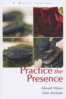
Journaling offers a powerful way to record your spiritual growth. Writing in a journal calls on you to be more conscious of the insights that occur daily in your life. It gives you an opportunity to examine your beliefs and be mindful of your choices.
Seeing Good At Work
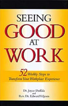
I have been through the book three times over three years, and am starting it again. This is not because the material in the book is not working, but because it is working so well! The weekly lessons keep me on track and focused on what is actually true and important, and help me experience more good in every area of my life. LS
No comments:
Post a Comment